And why leaves* should not be the image of organic visuals.
*or trees
By Rianne van de Rijt
There is one thing that really annoys my inner design radar, and it is such a big part of design it knocks you out of balance, is this thing called: cliches in design. I know that personal opinion is a great part in this, but to me using cliches in graphic design is a result of lack of inspiration and uniqueness. And the thing is every designer deals with it. The first thing that pops in your head when you receive a brief is probably a cliche of the subject. The level on how you turn the cliche around, into a better design concept, shows how good of a (graphic) designer you are. Knowing the meaning behind/ and context of a piece of design is essential, because using cliches might just be done on purpose. But most of the time it occurs from tight deadlines and lack of inspiration, and sometimes even directed from client demands to be the most ‘recognizable.’ That is why leaves and trees are used so much, because the client recognizes these as natural and organic symbols.
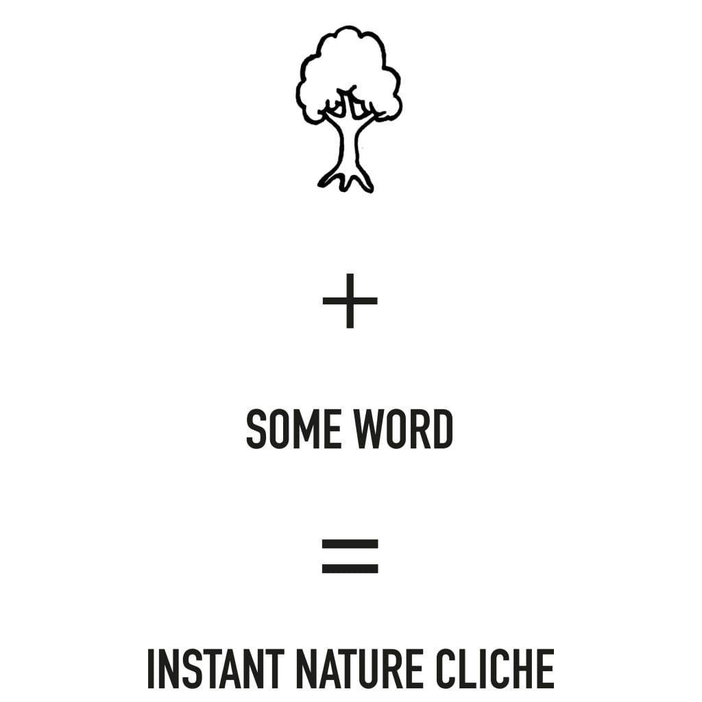
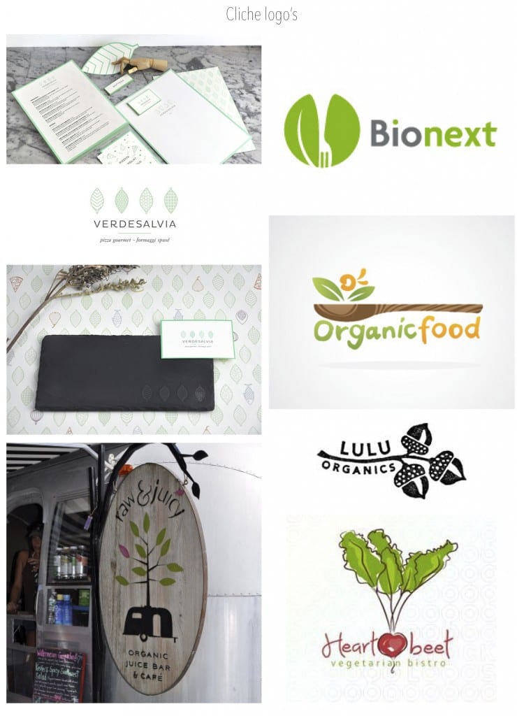
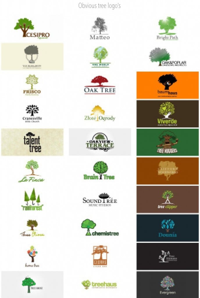
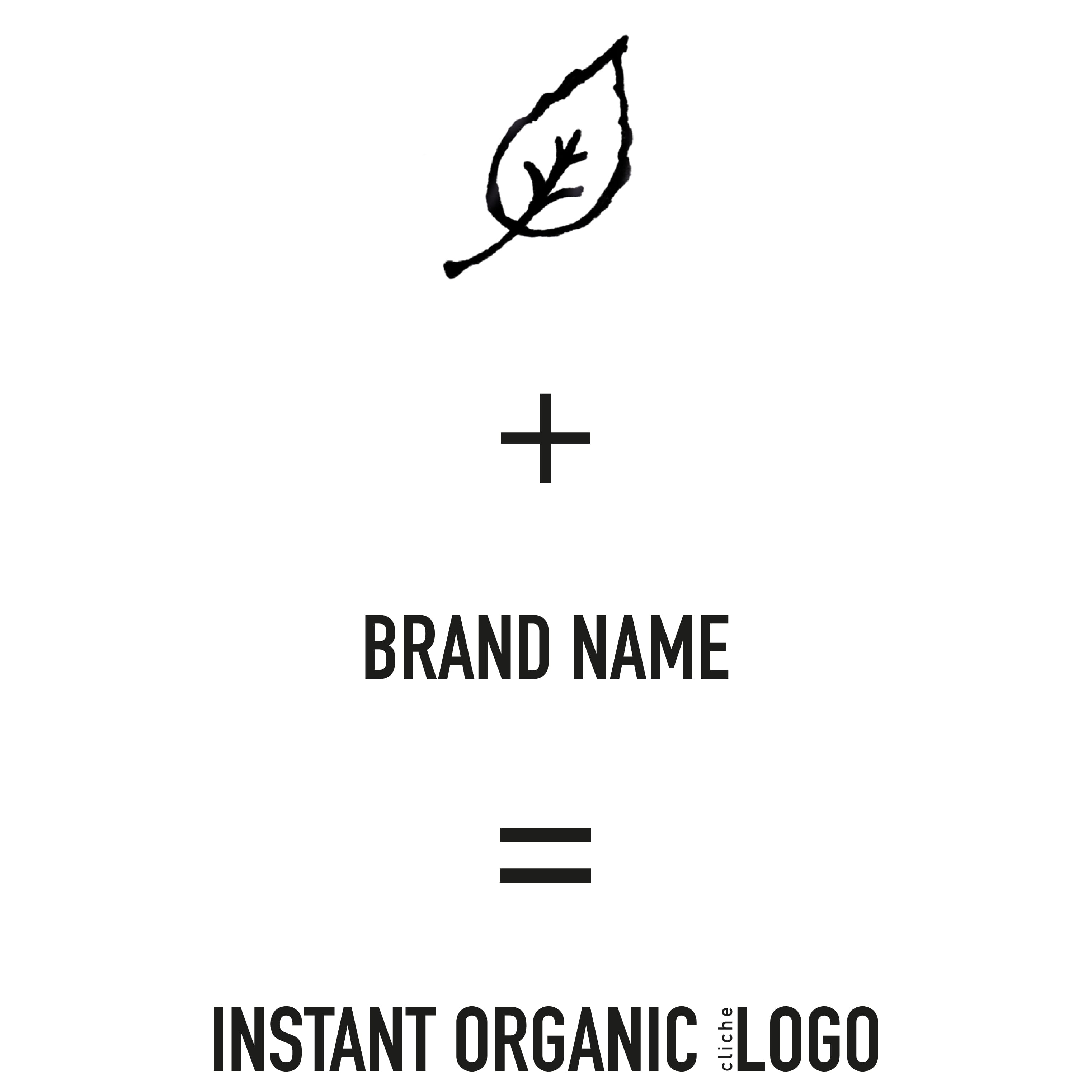
The things I notice within design for organic organizations is the abundant use of the colour green and leaves/trees icons in the design of logo’s and branding. If you see a logo with leaves and/or trees it is almost screaming: INSTANT BIOLOGICAL AND ORGANIC PLACE HERE! Often accompanied with a handwritten style lettering, and use of (too often) obvious recycled (brown) paper. The result here is that people get used to this kind of approach for organic businesses and start to discard the meaning and importance of the organic side behind the company. A fatigue is faced towards these cliche logo’s where people discard the logo without reconsidering their real meaning. And that is how a general symbol turns into a cliche, over usage and misuse of a once strong visual.
A lot of design cliches come form trends that emerged a while ago, as smashing magazine stated:
‘An image that may or may not have been memorable at one point, but has since been so overused that it has lost all ability to surprise.’
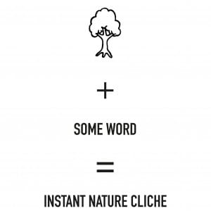
The use of trees and leaves in logo’s is a general and instant visual of ‘nature’ it is often misplaced within the context of the company. What is the thinking behind a ‘Talent Tree’ or a ‘tree growing out of a caravan’ logo? The outcome might look fancy but in the end it is always a Tree + 1 thing or a leaf + green + secondary colour + word thing. It is a cheap way out of a more complex design problem. Facing the design problem head on: getting people to notice and value the benefits of organic companies towards nature, should be more than just adding leaves. A look into unexpected areas might reveal new inspiration. Think of science, physics, laws of nature etc. Organic systems are not leaves, you could look at other metaphors for inspiration. Ant colonies for example create complex communities that work with nature on a completely biodegradable and intelligent level (Howard Gardner, Cradle-to-Cradle book). But can ants compete with leaves on a level of appearance, maybe a leaf is just more iconic on a visual level. But to choose the one thing that just look better and show a bit of nature is still a cheap way out. I still think there are/should be more ways to tackle the organic branding business. Maybe a more abstract way should be approached. Portrait nature and trees without showing or talking about the subject in a direct way, but placing the image, idea and thought in the audiences mind, unconsciously. Perceiving the idea of an organic company on a different level.
So one more thing: DON’T take the most readily-available solution from the environment around you, no matter how appealing they are. You just have to fight it with fierce designer ninja attitude of brainstorming, concept-creating skills and a lot of research and sketching. Cliches are a spreading virus to designers, your unconsciously can not escape. So you must consciously fight against it, and find your ‘medicine’ of dealing with the cliches and finding forms of inspiration that help you create unique work.
Definitely once in any design process you come face to face with cliches, when you’re stuck on a design, pop in a cliche! If people know nothing about the subject? Use cliches! But no matter how ‘good’ they seem to communicate something, it’s a cheap lie. It often results in mainstream design and does not show much originality and personality. The strongest forms of design (logo’s or posters) work when they are not mainstream, the complete opposite of cliches. So 1) Find the cliche and acknowledge that it is a cliche and 2) Try turning it around 360 degrees into something non mainstream. So now you are warned that cliches are everywhere around and you will face them. Trust me I know all too well, because I suffered from the design-cliche-virus too.
There is always room for improvement. So maybe I should take some Designer-Ninja-fighting-Cliche classes.
Reference:
http://www.smashingmagazine.com/2011/02/21/clich-s-and-idea-generation-how-to-turn-clich-in-a-successful-visual-solution/